Friday, 25 March 2011
Thursday, 24 March 2011
Feedback On Our Thriller
Positive comments:
The point of view shot of the message was very clear.
The use of music in the introduction works well with transitions and the feeling of the film. The effects of the photographs are good.
The camera angles chosen make it feel like someone is following the character, building tension and creating suspense.
The polaroid picture at 1:30 was good and the sound effects worked well.
The use of handheld camerawork was good and it created a feeling that somebody was constantly watching the character.
The use of the closeups on important props and the characters faces were good as it helped show her emotions to create a mood.
The use of still images in the market scene were good as it helped feel like someone was watching her.
The polaroid photos of her while she was walking through the market were good. It gave a feel of suspense and uncertainty. The main character appears to have no idea of whose taking the photos.
The camerawork was clever such as the zooming in and the slow motion which added suspense.
The sound effects were good as it added tension.
The music was intense and it was good acting.
Good music, it went well with the footage. Good shot of the phone when she gets a text.
The use of the pictures building up on the screen is good as it builds tension as you know she is being stalked for a while.
The use of polaroid pictures was good and they were used well to give a sense of reality.
Things to improve on:
The background sound is too loud.
The scream at the end is too short.
The zoomed out shot of the stalkers note could of been clearer as you cant read what it says very easily.
To improve the sequence we could have considered a better setting and possibly somewhere not in college as the sound can become crowded and does not go with the sequence.
Couldn't read the note left in the book and the scream at the end sounded slightly unprofessional.
The sound effects of the photographs almost break the tension created with the music.
There should of been more focus on the letter as the viewer doesn't know what it says. Could of made use of the character talking to create more of a mood.
The ending of the sequence was a bit comic, not sure the scream worked well, could of used a fade instead.
The title sequence could of done with being more interesting.
The picture she's holding at 0:46 is hard to read, could of zoomed in further.
Could of made the background noise the same and not notice the change between shots.
Tuesday, 22 March 2011
Thriller Pane
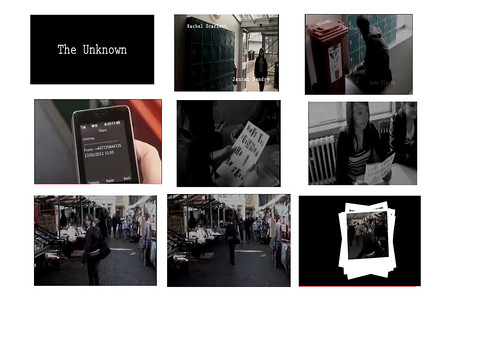
1- Title to the audience
2- Location and costume (establishing shot)
3- High angle shot
4- Prop and close up- (Use of the thriller convention of something out of the ordinary happening in ordinary situations- Her receiving the letter at school)
5- A thriller convention (gave a sense of danger)
6- Reaction shot showed with mid shot
7- Location
8- Long shot
9- Thriller convention (the build up of pictures gives a sense that the girl is being followed which follows the convention of building up suspense to the thrill of 'the unknown.' at the end.)
Friday, 18 March 2011
Tuesday, 15 March 2011
U1-29 Review
This group has used sound in their thriller opening really well. Both diegetic and non-diegetic sound have been clearly and clevery included in this opening, and the non-diegetic sound really shows their understanding of how to use it and where it's needed. I can tell that the non-diegetic sound that has been used is everyday background noises of cars etc, especially in the scene where Jess + Tom are playing football. The diegetic sound that you can hear throughout the clip is very clear considering they were filming outside and it was windy (often makes sounds quite fuzzy and hard to understand) but they managed to do it really well.
Friday, 11 March 2011
Thursday, 3 March 2011
Production Company Logo Ideas
We have decided to look at successful production company logos to help us decide on ideas when creating our own.


Labels:
Jade Clarke,
Jade Clarke and Rachel Scarlett and Sophie Abraham,
Janna Hendry and Rachel Scarlett
Tuesday, 1 March 2011
Sound Effects
We have added some tense music to certain parts of the sequence to help build up tension in crucial parts of the scenes. We also added louder more dramatic sounds when the titles came up to keep the viewer interested.
Thriller Opening Analysis
The opening title sequence I have decided to analyse is Vertigo (1960). The start of the title sequence, some intense music is used which creates a sense of mystery and tension, and these types of emotions are often created when watching a film in the genre of thriller.The use of dark lighting in the very first shot of an eye, is the first imperession we will have on the film, and due to this it unnoticeably makes us as an audience assume that it will be quite darkly lighted throughout the whole film. As darkness usually has conotataions of danger, the audeince will instantly start to come to terms with the fact that Vertigo is in the genre of a thriller or a horror.
It is not just the colour black that is related with danger and mystery, red is also known for this. So the fact that the black tint in the opening shot changes to red may suggest to the spectator that there could be some grusome scenes in this film, as red really portrays blood and gore.
It is not just the colour black that is related with danger and mystery, red is also known for this. So the fact that the black tint in the opening shot changes to red may suggest to the spectator that there could be some grusome scenes in this film, as red really portrays blood and gore.
Subscribe to:
Comments (Atom)
